I’ve been way too sick (terrible, horrible influenza, don’t recommend it for anyone) for a week for scanning, drawing or blogging, but I’ll just leave a brief prediction note here about the Egyptian protests before it’s too late. As I’ve previously noted, it’s suspiciously easy for people to choose sides in remote instances of unrest. Now everyone is on the side of the young, rights-demanding Egyptians who threaten to overthrow their government. My heart is, too, on their side, and I wish them the best of luck. However, my prediction is this: if they do succeed and Egypt undergoes a “regime change”, sooner or later the protesters will turn out to have been useful idiots for the islamists lying in wait. Sad face.
Year: 2011
Novel reading phenomenon
Posted by – January 14, 2011
Here’s an experience I don’t remember having before: reading two articles in two tabs and doing numerous other things at the same time (my powers of concentration are inexistent) and noticing halfway through that I’ve been mentally putting all the bits of them in the same place, confusing the two articles for a single one. One was this New Yorker piece about the “composure class”, made up of surreally balanced and successful people and new ideas in the mind sciences, and this Atlantic one about the world’s financial future and specifically its new, meritocratic, internationalist elite.
edit: …by which I didn’t mean to say that they were so similar, but they shared some themes (or people types), and overall the effect of mixing them up was very interesting. Maybe they should have been the same article.
Human bio- and conditioning diversity
Posted by – January 14, 2011
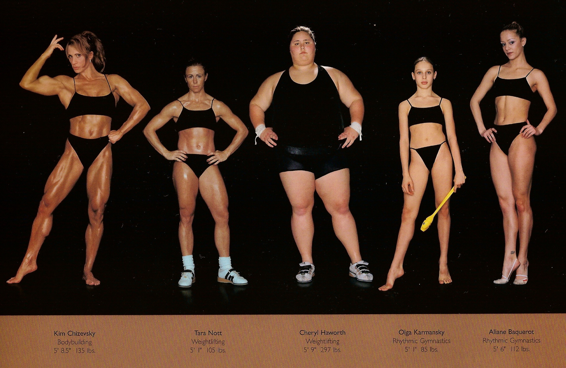
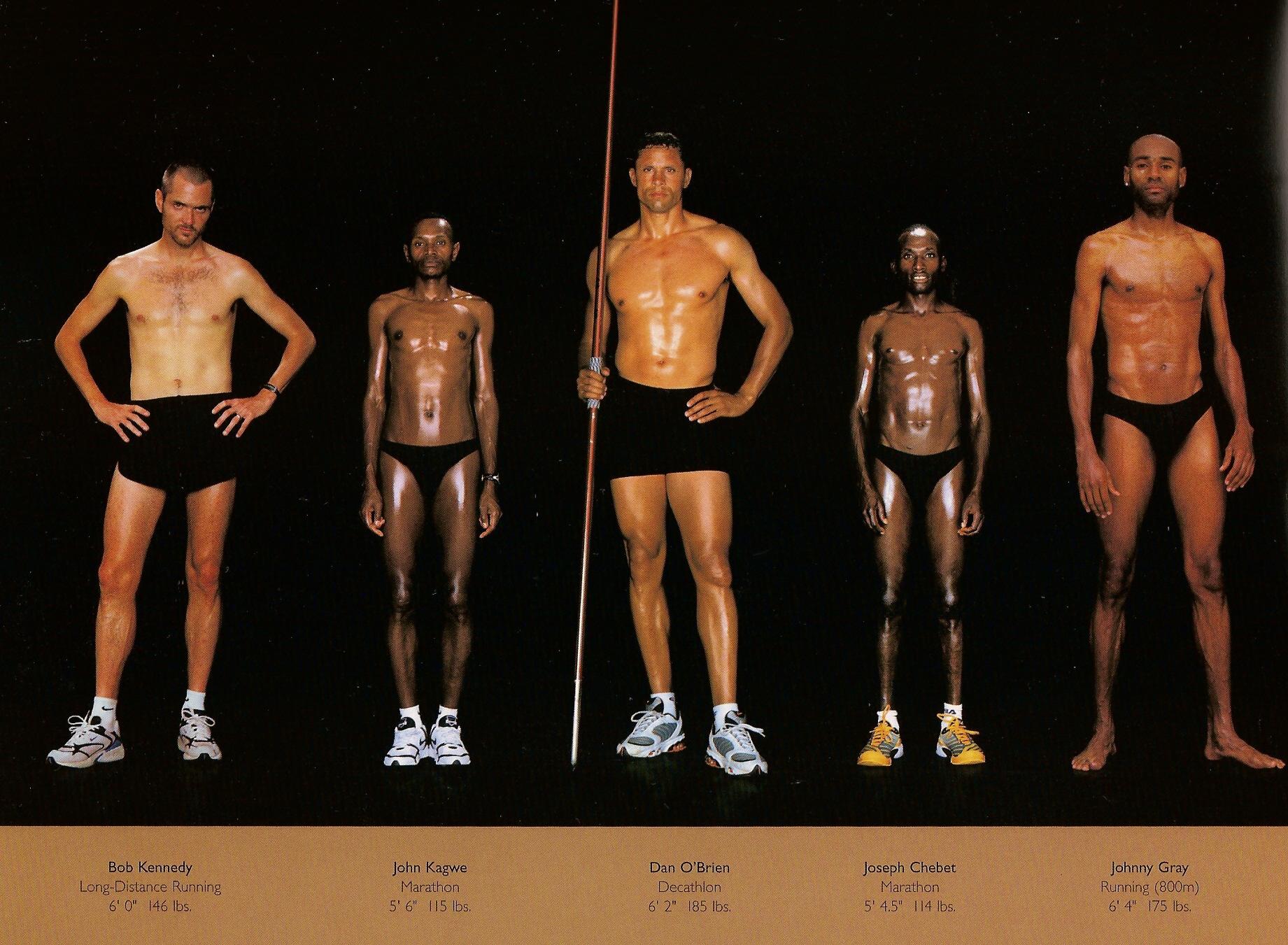
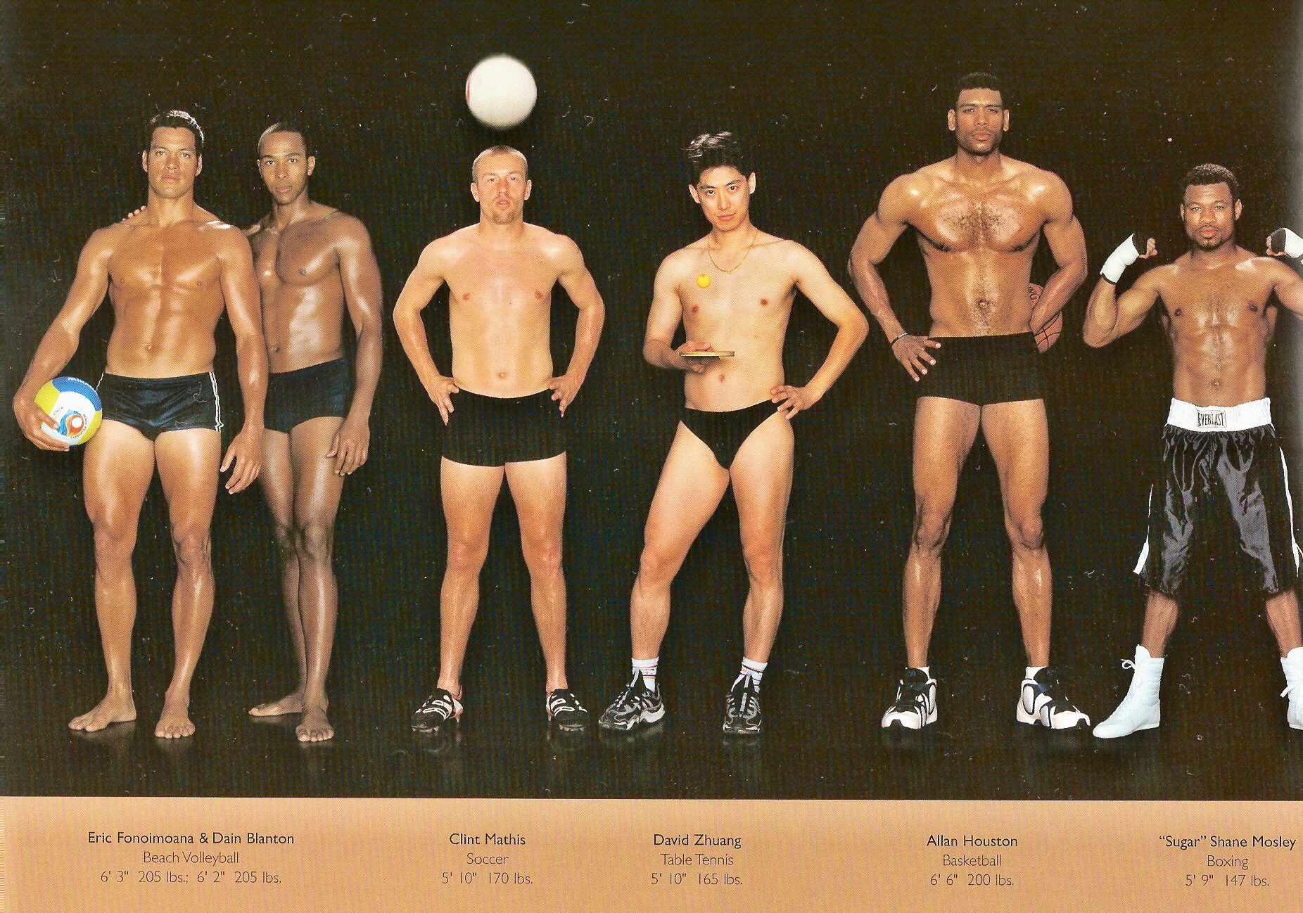
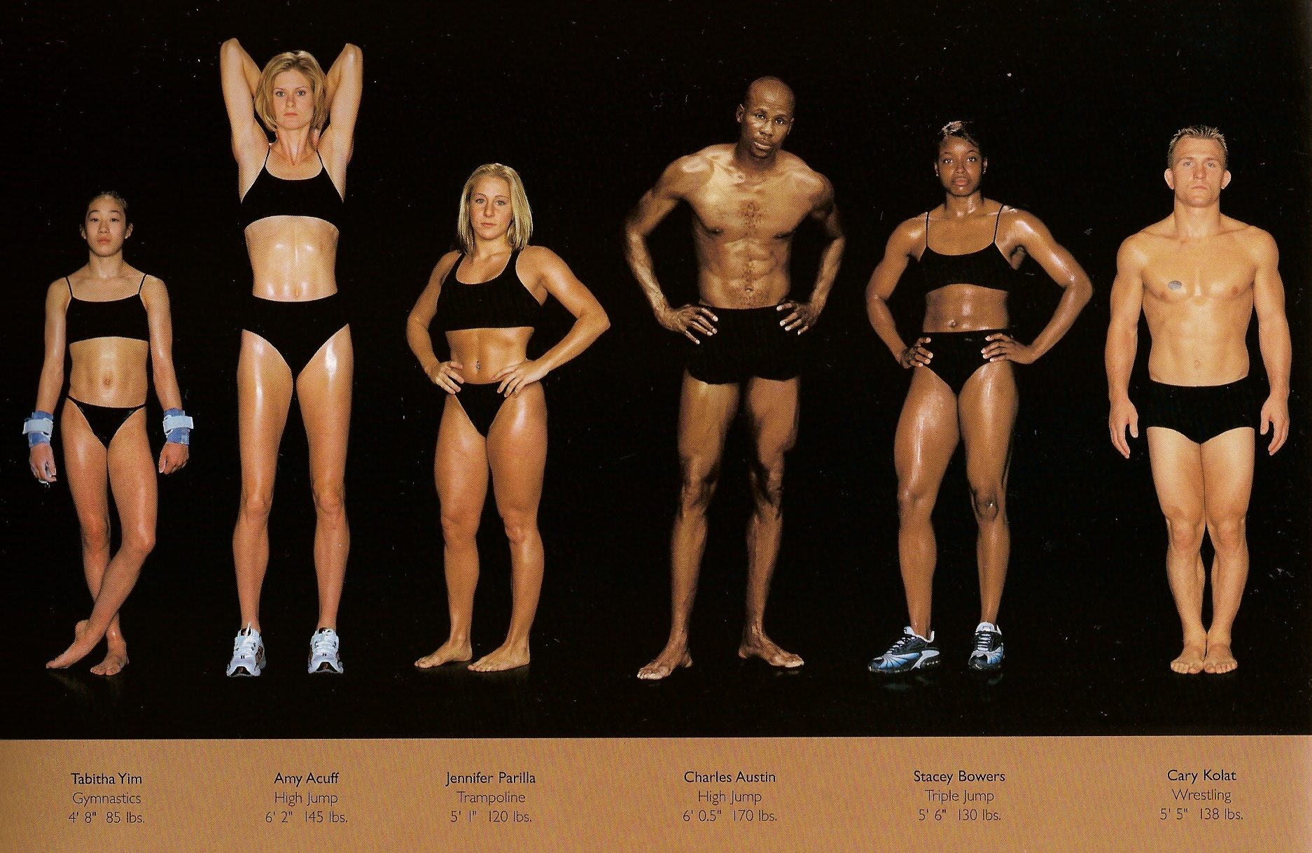
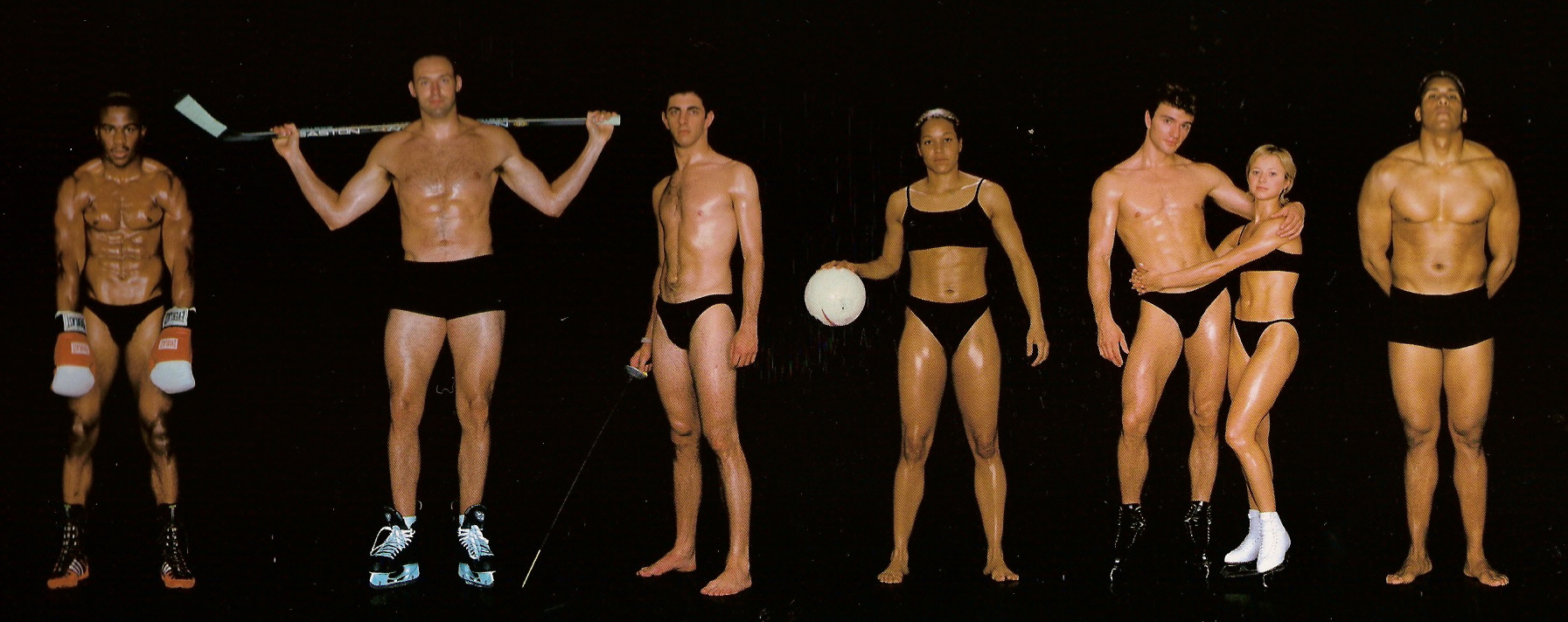
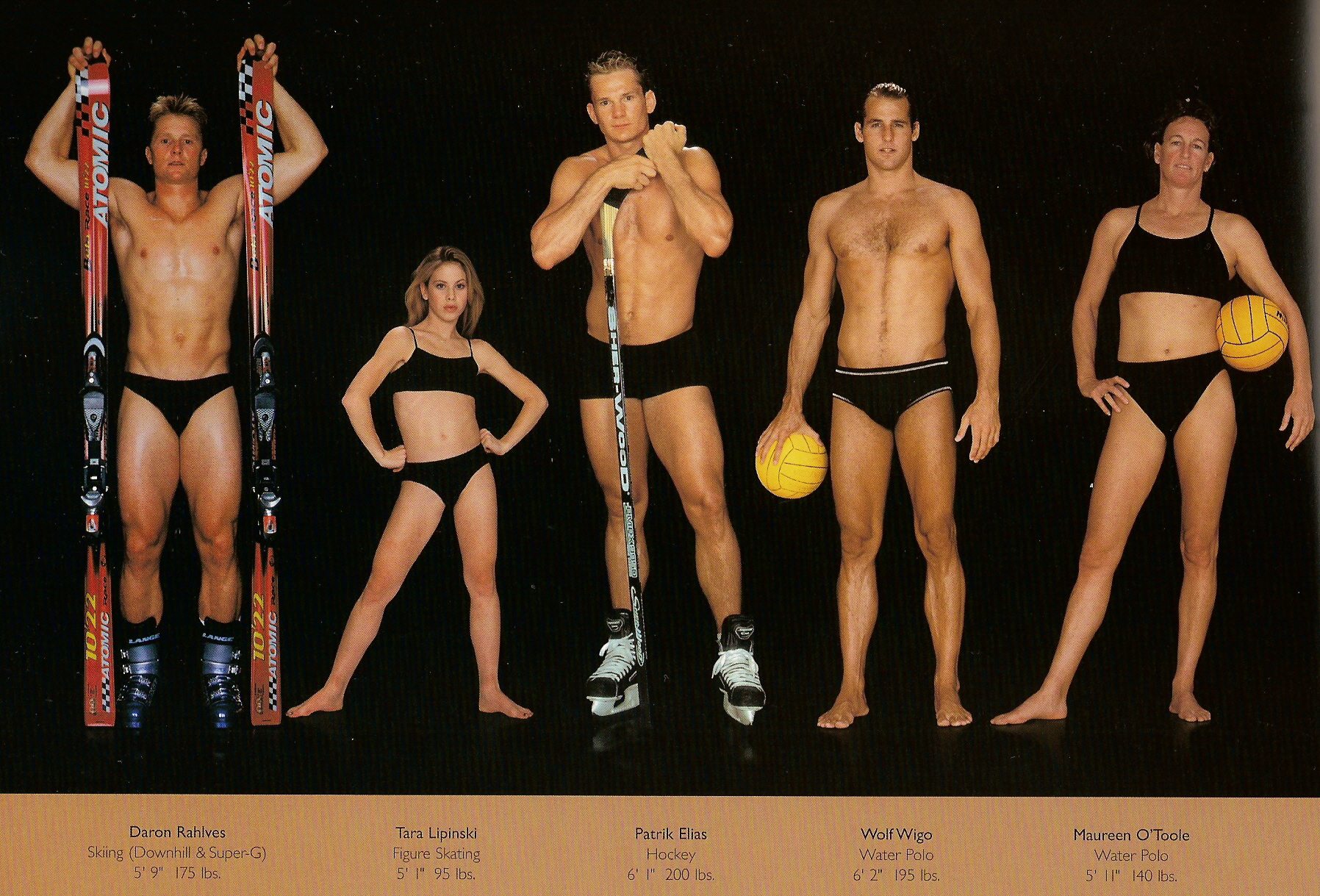
There are many interesting resources for visual artists on the Internet: exercises, catalogues of objects, environments and scenarios etc. Here’s a very interesting one with different athletic body types. Some of my favourites:
- This one is practically all about different types of conditioning – the most striking thing to me about it was Olga Karmansky’s gymnast’s posture.
- This one for the long-distance runners. While Bob Kennedy, John Kagwe and Joseph Chebet have certain similarities, you get a feeling for the competitive edge the Kenyan runners’ (who look so similar to each other they could be from the same ethnic group as well, perhaps Kalenjin, known for runners) body types have.
- This one for Allan Houston’s lower abdominal muscle curve, David Zhuang just in general and Clint Mathis’s classic flat footballer’s body. Clint Mathis brings to mind Christiano Ronaldo who isn’t flat but quite muscular, which I suspect is for aesthetic reasons.
- This one for the tall Amy Acuff – the proportions seem different, but where? I think in the legs, they’re very long. Of course everything else is longer too. When someone is described as “squat”, picture Gary Kolat.
- This one for monster trapezius muscles on the guy on the right.
- This one for the very mannish body of Maureen O’Toole.
Beautiful pop junk
Posted by – January 14, 2011
Now that Natalie Portman and Mila Kunis have been given a plausible artistic sheen and a lesbian scene in Black Swan, it’s time to do some milking, with some of the most beautiful instant market segmenting I can recall. Really, it brings a tear to my eye. Their next movies will be No Strings Attached for Natalie Portman:

Don't need a trailer to spoil this one
and Friends With Benefits (yup, the tagline from Natalie’s movie) for Mila Kunis and Justin Timberlake:

Is he saying something goofy or relating a hilarious anecdote depicting reckless but non-threatening pleasure-seeking? You'll have to see the movie! Also check out the body language: Mila's submissive head posture & open body posture, Justin with the standard low-held drink, exposed crotch, taking up space, displaying some arm muscle... Uh, excuse me for a moment, I have to go have a cold shower
Anyway, you might think this is a catty competitive situation with the two hot leading ladies doing the exact same movie at the same time (made and distributed by different companies though), but I think it’s sheer brilliance on everyone’s part. It makes people choose sides, augmenting the brands of everyone involved in whatever way the movies end up being perceived.
And for the short term, it’s beautiful segmenting – by being so similar, these two cheap-to-make movies force differentiation of perception. No Strings Attached is Facebook to Friends With Benefits’ MySpace. NSA is for white kids, FWB is for black and latino kids. NSA is sophisticated and tense, FWB is cozy and fun. NSA will gamely play around a little with gender and sexual norms before concluding with an absolutely standard resolution, FWB will play it 100% straight, probably with a sexual modesty / morality point in there somewhere. You get the idea.
I feel like a happy duck with a plastic funnel going down my oesophagus blasting rich, fattening meal & pop junk & cultural norms into my gut. Or would if I went to see movies like this. For now I’m actually just doing it to myself in my imagination! Okay, time to wrap it up.
Year of pictures, week 1
Posted by – January 11, 2011
Not a great week for pictures.
First, I don’t want to give the impression that I’m all about trying to sketch real-world objects, so here’s a piece of creativity from deep within my soul. I call it “Gretel is affected by a mushroom and vomits out his soul”:

Cultural power not too important to give to politicians
Posted by – January 10, 2011
Leftism is the ideology of students, intellectuals, labourers, people who rely on the welfare state in some way, women, and artists. With that in mind, here’s a list of the most influential figures in Swedish cultural life, as compiled by Göteborgs-Posten:
- Lena Adelsohn Liljeroth, Minister for Culture
- Fredrik Reinfeldt, Prime Minister
- Anders Borg, Minister for Finance
- Marie-Louise Ekman *, Managing Director of the Royal Dramatic Theatre (“Dramaten”)
- Kennet Johansson, Director General of the Swedish Arts Council
- Eva Hamilton *, Managing Director of SVT, the national television channel
- Cissa Elwin Frenkel, Managing Director of the Swedish Film institute
- Björn Wiman *#, Head of the culture section of Dagens Nyheter, the largest Swedish newspaper
- Peter Englund *, Permanent Secretary of the Swedish Academy (which selects the repient of the Nobel prize for literature)
- (shared)
Daniel Birnbaum *, Director of the Museum of Modern Art in Stockholm (Moderna Museet),
Jonas Bonnier *#, CEO of the Bonnier group, a media conglomerate,
Kerstin Brunnberg, Chairman of the Swedish Arts Council
I’ve marked people with some kind of relevant experience or training with a * and people whose jobs aren’t under some kind of political control (publicly funded) with a #.
It’s somewhat natural that since leftism advocates the public funding of art, many artists are attracted by the belief that leftist politicians understand artists, and perhaps more mercenarily by the simple expansion of opportunities for them to do profitable work. But isn’t there a very serious downside to being an artist within a system ruled by politicians? According to the Swedish list, culture there is most influenced by career politicians who have no special interest or ability related to the arts. For them its encouragement and content are political questions, and I think it’s very difficult to avoid it showing. Not as party politics, of course, but as a deeper level of lackeyhood.
In Finland, some arts are completely dominated by public money – examples that come to mind are theatre, dance, classical music, television, video installations and performance art. Literature is mostly private, I think (or is it?). The remaining visual arts and movies are probably somewhere in between. Artists are probably one of the most politically uniform groups (at least in public) I’m familiar with.
Of course, the flipside is that without political power, it’s not idealistic, freethinking artists who are in charge but Oprah and Madonna.
Comment-seeking blog timeshifting
Posted by – January 10, 2011
I do have pictures but won’t put them up just yet – scanning them in is boring, plus I might make one that doesn’t suck today and replace something with it.
I’ve finally moved ~all my blog-reading to Google reader. It’s very convenient, but has one glaring flaw – I like to read new entries as soon as I notice them, which means that they usually won’t have many comments. And I don’t want to check back to see every old entry in case it might have interesting comments. What I’d like is a system that would timeshift entries, only telling me about new ones when some time margin has passed. Maybe it could take into account some avoidance of huge backlogs, to space out dry periods. Googling didn’t turn up anything. Surely I can’t be the only one?
Year of pictures, week 0
Posted by – January 2, 2011
I consider weeks to begin on Mondays, so this is for the first two days of the year.
I immediately went back on what I said about not attempting difficult things like shading, and started doing a really ridiculously over-difficult study of a paper-covered vase and an amaryllis plant in it.
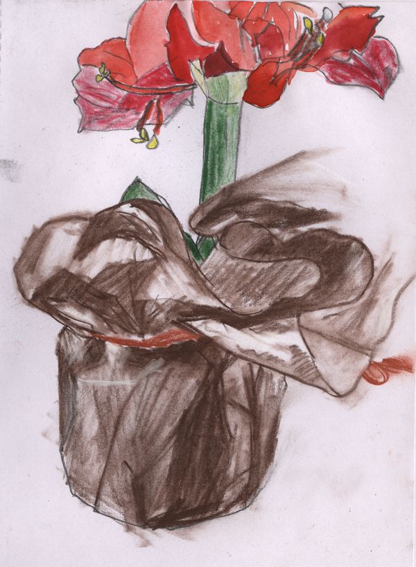
I could spend ten hours doing this kind of texture and not get it right. As it was, I spent about an hour. The vase part was sketched with a light sepia pencil, with some highlights in a white pastel one. I used a paper stump to get some of the smoother shading parts. The red ribbon I did with a stick of burnt sienna (which is not intended for detailing, but it’s what I had). There’s some graphite pencil in the outlines as well. I started doing the colour for the plant with a set of waxy sort of pencils (quite old ones my wife had gotten at some point), but didn’t like them much. Very difficult to get good coverage or shading, plus you’re completely stuck with the colours in the set. The green parts are in the wax colour, as are the left-and rightmost red leaves and yellow anthers. I then gave up on the wax and finished up in disgust with my trusty watercolour set (six incredibly well chosen colours).
At the very beginning I tried to get “all” the detail in, but once I realised there was just no way, I settled for getting a right-ish impression. Here’s a photo of the plant – the lighting’s not quite right and the orientation is a bit different here, but you get an idea of my degree of fidelity:

Another problem of mine is using space: not only did I end up cutting off half the flower, I’d made the vase so big and detailed that the flower had to be rather smaller than life to fit in at all. I should have made it a natural size, draw only the very bottom and make the picture be more about the vase (although that was my main interest anyway).
Here’s a gel pen rendition / sketch of my pocketknife / multitool thing.
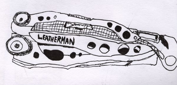
Not much to say, really. You can again see that I ran out of space. This sort of thing I could do a bit better by just spending more time on it and being careful, but for now I want to do things fairly quickly and just get used to drawing. Anyway, it’s not that bad in a cartoony way.
